 Home
Home
 Forgot your password?
 New user?
Visual Redesign Notes
STATUS
 Status 12/5/2006 by LLD: BASICALLY, VISUAL RE-DESIGN IS COMPLETE in Kepler 1.0 Beta 2.
Overview
Main Screen Design, Logo Design, Color Scheme, Symbology, Additional Symbology, Notes on Color.
- Proposed logo was not adopted but current logo was re-colored to match new color set.
- A few minor color adjustments left to be made in main window frame (some of the greys, highlight color).
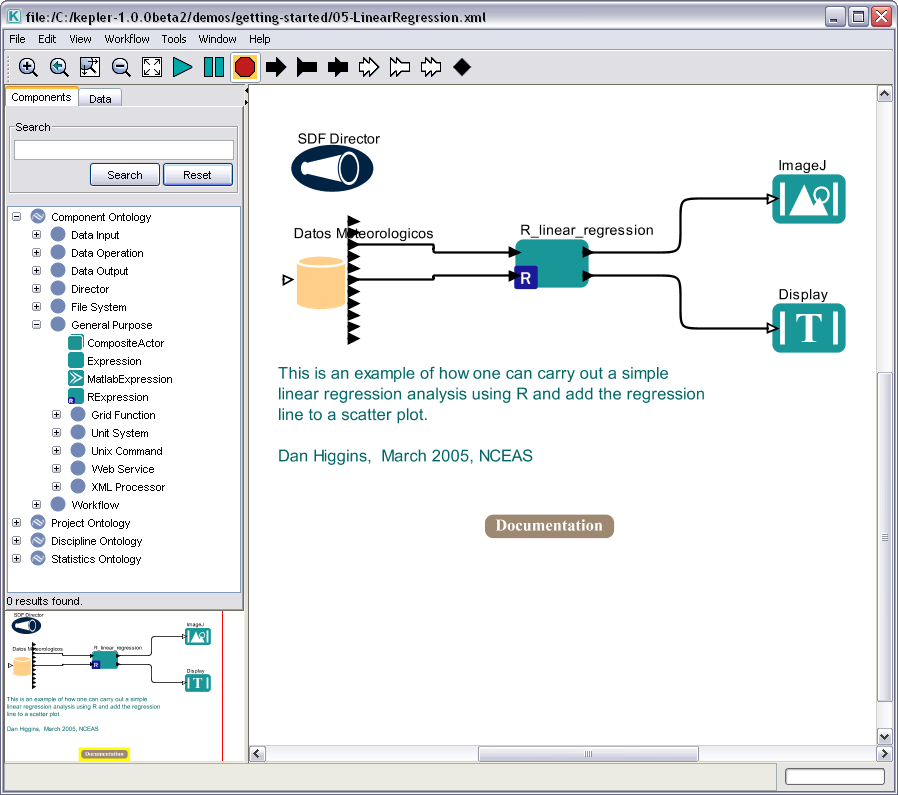
Main Screen in Kepler 1.0 Beta 2
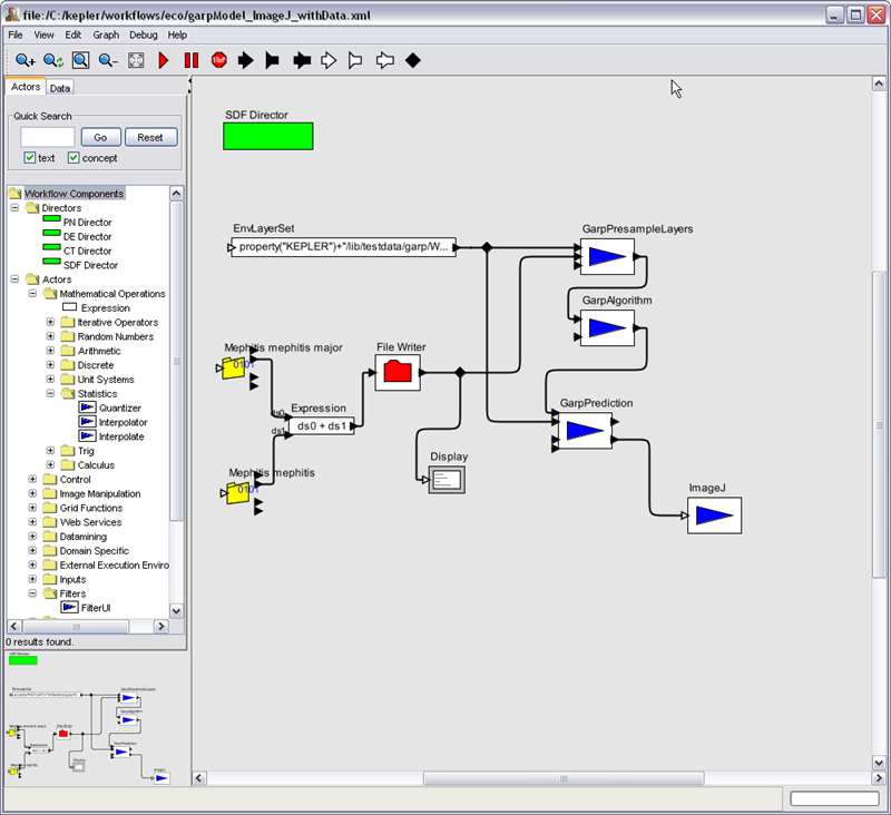
Background -- Original and Proposed Designs previous to Kepler 1.0 Beta 2
Why is visual design important?
- “Visual design and aesthetics affect user confidence in and comfort with your application.” (Java Look & Feel Design Guidelines)
- “What we see influences how we feel and what we understand. Visual information communicates nonverbally, but very powerfully. It can include cues that motivate, direct, or distract.” (Windows Guidelines)
- “Effective visual design serves a greater purpose than decoration; it is an important tool for communication. How you organize information on the screen can make the difference between a design that communicates a message and one that leaves the user feeling puzzled or overwhelmed.” (Windows Guidelines)
- “Aesthetic integrity means that information is well organized and consistent with principles of good visual design. Your product should look pleasant on the screen, even when viewed for a long time.” (Apple Guidelines)
Alan Cooper, Father of Visual Basic and well known author of The Essentials of User Interface Design writes:
- “Visual design has an enormous impact on the initial impression your product presents …”
- “Regardless of its behavior, its visual expression must appeal … Just as important is ensuring that users of your product understand affordances and thoughtful visual cues.”
- “Icons represent a key point of interaction between your software and its users.”
SEE Notes on Color at the bottom of this page for specific issues with using lots or bright colors and using too many colors.
Overall Visual Re-Design
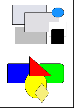
Original Main Screen Design:
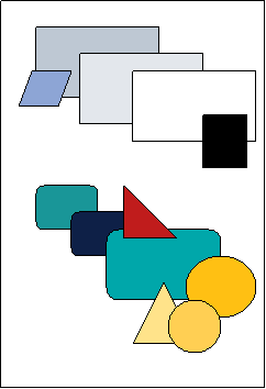
Proposed Main Screen Design:
Design Rationale:
- Improve readability (higher contrast on white background in main workflow area)
- Unify visual language (balance, symbols and color)
- Create and coordinate color palette
- Coordinate symbol set
- Professionally designed graphics

Logo
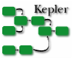
Current Logo:
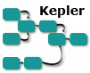
Current Logo recolored to match proposed teal color set:
Proposed Logo:
Design Rationale:
- Simplify logo
- Make "Kepler" more prominent
- Use right angled lines for balance
- Coordinate logo with new color scheme
Color Set
Current Color Set
Proposed Color Set
Design Rationale:
- Use muted tones.
- Reduce number of bright colors that continually draw the eye.
- Use color to highlight and emphasize when needed.
- Coordinate color usage.
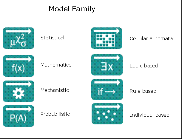
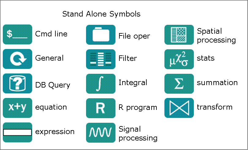
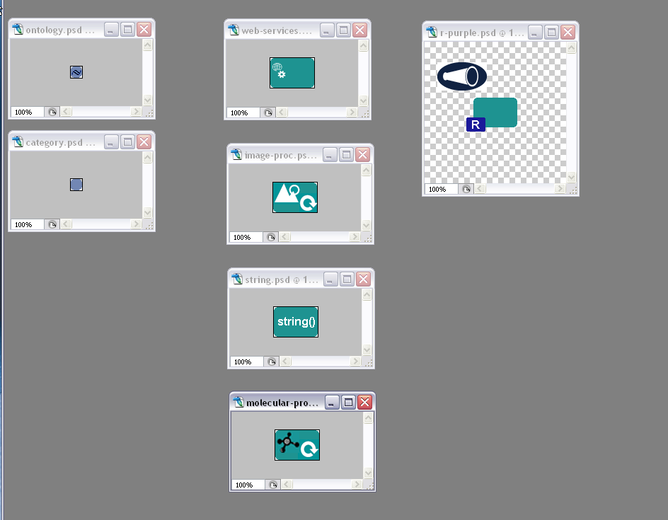
Symbology
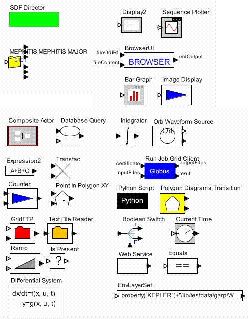
Sample of current symbology:
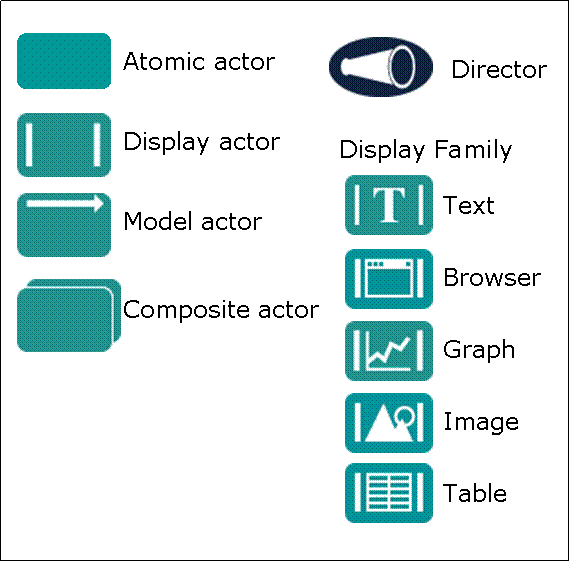
Proposed symbology:
Design Rationale:
- Use a limited number of symbols/shapes.
- Use simple shapes.
- Use standard/known symbols or ones that are easily learned.
- Add some uniformity.
NOTES for symbols:
May need a few more categories like:
- string operations
- array operations
- control operations (stop, pause, sleep etc.)
- low level operations like put, get, web service etc.
- something for parameters (small solid dot)
- something for variables (small diamond)
- different symbol for classes/categores instead of file folder -- something like solid circle perhaps with small decoration
We will need something for the provenance recorder (post release 1.0):
- stand alone like director
- not an actor but a feature of a workflow
- for regular recording to file or DB maybe pen and paper
- if visual recording is added, maybe a piece of film strip
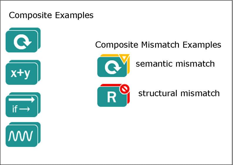
Additional Symbology:
This section is to record ideas and decisions about additional symbology after doing a first pass of assinging the new icons -- it was determined that we needed some additional catagories. See: https://code.kepler-project.org/code/kepler-docs/trunk/legacy-documents/dev/usability/graphics/graphics-inventory.xls
Some sample ideas for additions:
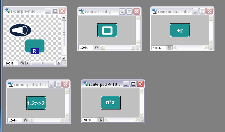
External Processing Families:
Notes on Color
Windows Guidelines- Use color as a secondary form of information.
- Use a limited set of colors.
- Muted, subtle, complementary colors are usually better than bright, highly saturated ones, unless you are really looking for a carnival-lie appearance where bright colors compete for the user’s attention.
Windows MSDN Design Specs and Guidelines
- Although the human eye can distinguish millions of different colors, the use of too many colors results in visual clutter and makes it difficult for the user to discern the purpose of the color information. The colors you use should fit their purpose. Muted, subtle, complementary colors are often better than bright, highly saturated ones unless you are looking for a carnival-like appearance where bright colors capture the user's attention.
The Elements of User Interface Design (Mandel)
- Color has often been misused as a decorative element. This limits its ability to portray meaningful information in the interface. Tufte (1992) reiterates one of the main principles in using color: “Above all, do no harm.”
- Properly used, color can be a powerful tool to improve usefulness of an information display system. The inappropriate user of color can seriously reduce the performance of such a system, however. (Gerald Murch 1984)
- Since color is such an automatic attention-getting mechanism, lots of color in an interface will cause users to pay attention to the screen. This helps make a user interface seem somehow friendlier and easier to use. However, this “Las Vegas” effect can actually distract users from their tasks.
- Because color has such a strong effect on human perception, use color appropriately. It is too often used to attract attention rather than designed to be suitable for long periods of computer work.
- Use of maximum of 3-8 colors.
- Use familiar, consistent color codings with appropriate references.
- Use the same color for grouping related elements.
- Use high-value, high-saturation colors to draw attention.
- Saturated blue should be avoided for text, thin lines, and small shapes.
- Do not overuse color.
- Similar colors connote similar meanings.
- Brightness and saturation draw attention.
- Utilize colors in the interface with the same care and frugality as if each color had to be cost-justified. Even if computer displays can show 265, 1024 colors etc., don’t try to use as many colors as possible. The basic principle is: Design the user interface first in black-and-white and then add color later, and use color only where needed.
Apple Color Guidelines
- Limit the number of colors.
- To maintain consistency with operating system, use as few colors as possible.
- Fewer colors results in less visual clutter on the screen.
- Colors on Gray
- Colors look best against a background of neutral gray.
- Colors will stand out more if the background and surrounding areas are gray, black or white.
Designing the User Interface: Strategies for Effective Human-Computer Interaction (Ben Shneiderman)
- Use color conservatively – show meaningful relationships.
- Limit the number of colors to 4-7
- Be consistent in color coding use throughout the system.
Practical User Interface Design: Making GUI’s Work (Carl Zetie)
- More design errors committed with colors than any other aspect of UI design.
- Color is meaningful – people associate meanings and implications with color.
- Color is ergonomic – eye is drawn to color, disrupting flow of the screen.
- Color is operational – users expect color difference to be semantic, color changes are interpreted as having meaning; designer should support this assumption.
- The golden rule is that the designer must never rely on color alone; it must always be a redundant cue.
Summer HCI Course at Berkeley 2001, User Interface Design, Prototyping, and Evaluation (Group for User Interface Research, Berkeley)
- Pure (saturated or bright) colors require more focusing than less pure (desaturated) – don’t use saturated colors in UIs unless you really need something to stand out
- Desaturated combinations of colors are better because they required less refocusing
 about how to chage the actor's color
