Query Builder Dialog
STATUS
 The content on this page is outdated. The page is archived for reference only. For more information about current work, please contact the GUI Group.
Overview
Proposed changes and design issues for the standard and SQL tabs of the Query Builder.
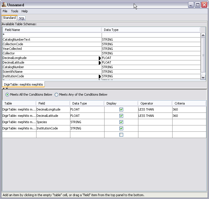
Current Standard Tab
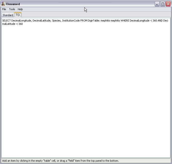
Current SQL Tab
Proposed Minimal Changes
- give the dialog a title - Query Builder
- remove menus (no menus in dialogs)
- change "Standard" to "General" on first tab - this will mesh with other dialog designs coming down the road
- on Standard/General tab
- remove the expandable/collapsible tiny arrowheads and replace with thick movable separator bar
- remove bottom data tab and replace with drop down box listing available tables, this should go at the top of the top section right next to "Available Table Schemas:" -- the current design is confusing to have tabs at bottom and top and it does not support data sources with large numbers of tables which would produce large numbers of tabs at the bottom of the top half of this dialog
- rename "Display" to "Include in Query" and make that the first column with the default checked
- on the radio buttons, make things sentence case and also reword as follows: Meets ALL included conditions listed below. Meets ANY included conditions listed below.
- all column headings should be centered for consistency
- display drop down box indicators in table cells that have drop down choices so user doesn't have to discover that there are choices available (this is the standard design for other tables to be included later)
-
on SQL tab, make it grey to indicate that this can't be edited but is merely for display purposes
Design Issues for Future Release
- the top/bottom dragging behavior is non standard -- this should be changed to a right/left orientation which is standard where things are selected from a list on the left to be included in a smaller list on the right and we should also look at adding the standard "add/remove" buttons even if we keep the drag behavior because people don't always realize that dragging is possible and lots of our other dialogs will use the standard add/remove buttons.
